Mysterious case of flexbox
이번에… 가변 대응이 가능한 화면을 만드느라고 약간 애를 먹었지. 그리고 왜 두 컴포넌트의 레이아웃이 잘 맞지 않는지 등등 나를 괴롭히는 게 많았다.
내가 해주어야 했던 것은… 아래의 레이아웃인데
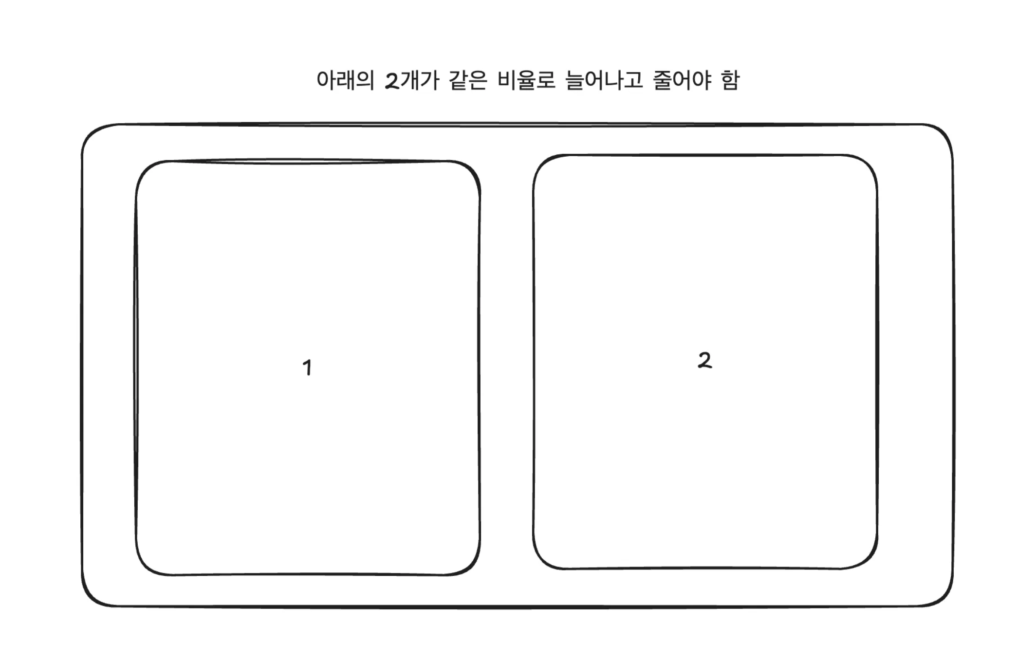
화면이 엄청 커졌을 때 1번은 제대로 안 늘어나고 2번만 많이 늘어나더란다. 2번에 컨텐츠가 더 차있기는 했다.
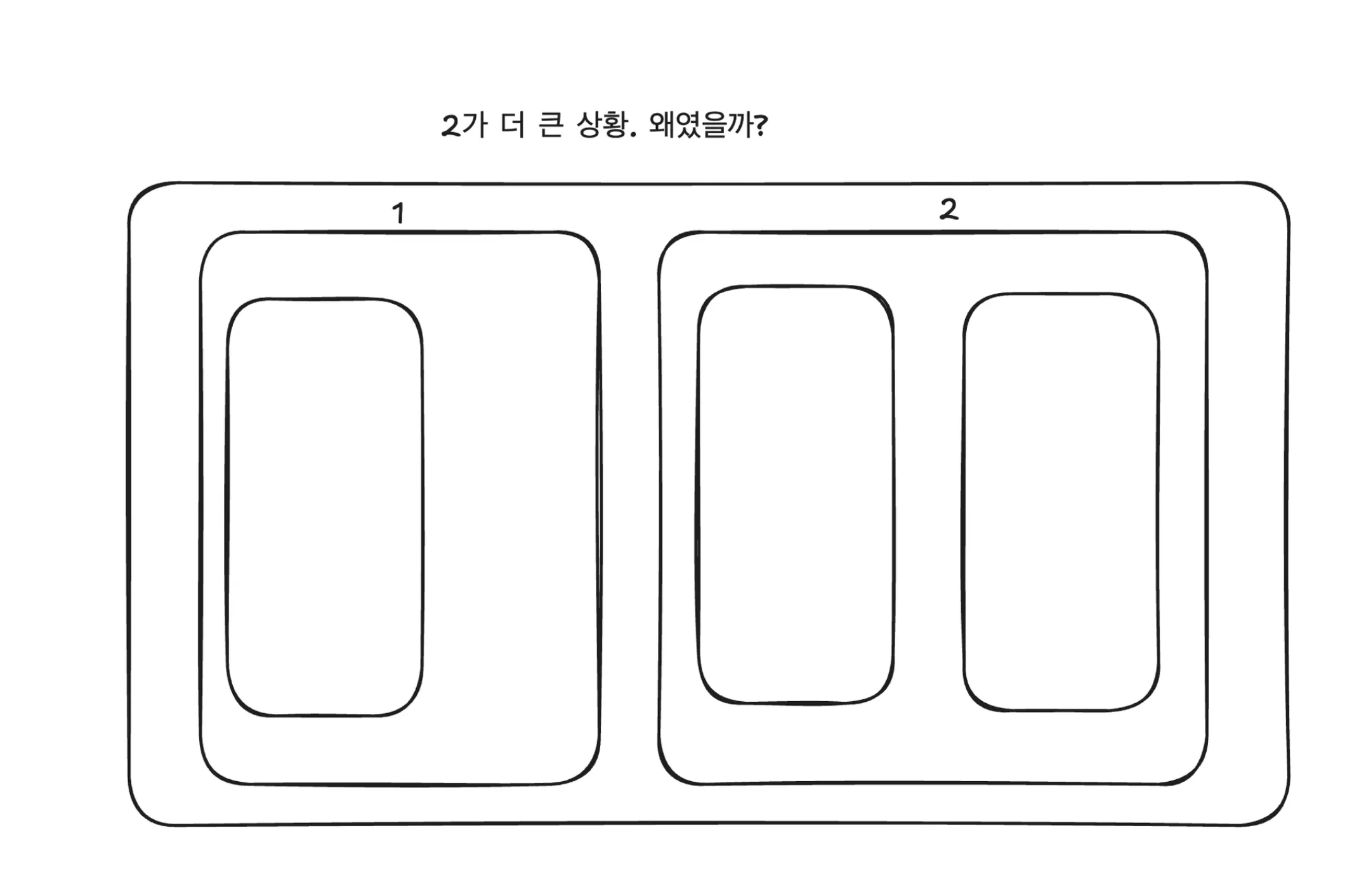
질문을 한 번 정리해보자
Q:
✅ 만약에 flex-box에서 50% 50% 비율을 딱 맞추고 싶다면 어떻게 해야하는 걸까?
- 밑과 같다. flex-basis: 0 으로 주고, flex-grow: 1을 하면 됨
✅ How to create equally sized items?
- flex-basis: 0 로 주면 해결이 된다. 이게 왜 그러냐면.. flex-basis 의 기본값때문이다.
To create three equally-sized items, even if the original elements have different sizes, set the flex-basis component to 0:
flex: 1 1 0;
✅ flex-basis 프로퍼티가 뭐야?auto 로 지정되어 있을 시 아래와 같은 상황에 따라서 initial size가 지정된다. 오…굿굿..읽어보면 자세한 내용을 알 수 있는데, 재밌는건 item의 max-content 사이즈를 쓰네?그리고 widith 가 set 되어있는 경우에는 그걸 flex-basis 로 사용한다는군.❗️flex-basis: 0 and flex-basis: 0% 이 어떻게 다른지?
- 이거 진짜 재밌음! 0은…height를 없게 만들고 0%는 content value. 그래서… flex: 1을 했을 때 이게 flex-basis: 0% 니까… overflow가 일어날 수가 없지…ㅋㅋ
This means the flex-basis used is the max-content size of each item.
If no such size is set, meaning the item is auto-sized, then auto resolves to the size of its content (see the min- and max-content sizing discussion above), meaning the flex-basis is the item's max-content size.
If flex-basis is set to auto, the initial size of the item is the <length-percentage> size of the main size, if any was set. For example, if the item has width: 200px set, then 200px would be the flex-basis for this item. Percentage values are relative to the flex container's inner main size. If width: 50% were set, the flex-basis for this item would be half of the container's content-box width. If no such size is set, meaning the item is auto-sized, then auto resolves to the size of its content (see the min- and max-content sizing discussion above), meaning the flex-basis is the item's max-content size.
shrinking 이랑 growing 이 일어나기전 내츄럴한 사이즈.
중요한 것들
- It is helpful to know the nartural size of flex items before any growing or shrinking takes place
- min-content, max-content… 이해를 하는 것이 flex-grow flex-shrink 를 할 때 중요함
- Important concepts when working on the main axis
- What determines the base size of an item?
- 이걸 보고 나면… flex item의 base size를 알기 쉬움.
https://codesandbox.io/p/sandbox/flex-box-ratio-z2zfgl?file=%2Findex.js%3A1%2C38
느낀점
- flex-basis에 대해서 확실히 뭔가 좀 알게 되었다.
- flex-basis: 0% or auto 는 content의 사이즈로 간다는게…드디어 제대로 이해. 그래서 overflow가 안 먹지
- min-height가 재밌네. 세팅된 min-height가 max-height나 height 보다 크다면 height로 min-height가 쓰이는 게 말이야.
- The element's height is set to the value of min-height whenever min-height is larger than max-height or height.
참조
- Controlling ratios of flex items along the main axis (다시 읽기 시작했는데 very enlightening!)